

Appears In
Have you ever heard that some people consider pairing black and navy-blue clothes together to be a fashion faux pas? The similar color tones make it hard for the eye to discern one from the other, which can quickly turn a “fashion statement” into an eyesore. Color contrast, or the ability to distinguish light between two objects in close proximity — such as foreground and background — is a common way that we make sense of our environment that is often taken for granted. From deciphering different colored lines on a street map to cheering for our favorite sports team in their signature jersey color, we assign meaning to color in ways that are second nature to us in our everyday lives.
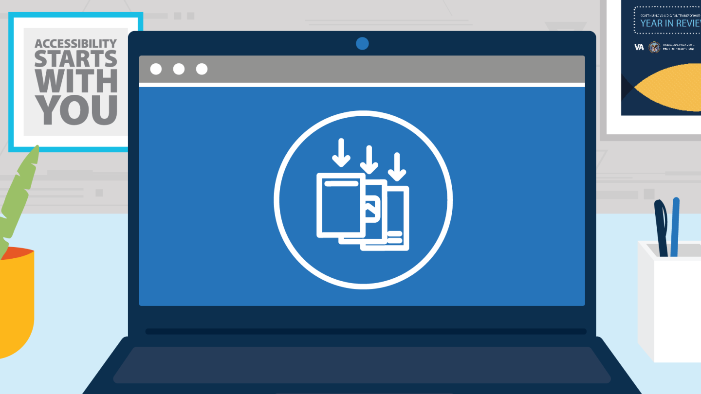
For individuals with vision impairment, low vision, or for anyone with an eye condition that causes them to perceive colors differently than the majority — commonly referred to as color “blindness” — deciphering nuances in color contrast is a challenge that impacts the way they digest information, both in print and online. In our digital age, color contrast is also an integral component of communicating information electronically: from websites to PowerPoint presentations, emails to Word documents. The Department of Veterans Affairs (VA) Office of Information and Technology (OIT) understands the importance of designing accessible technological products, including incorporating correct color contrast, to effectively communicate health information to Veterans and their caretakers who may be visually impaired, or be affected by low vision or colorblindness.
Using Color Contrast Effectively
According to the World Health Organization, approximately 2.2 billion people are visually impaired. Of this demographic, an estimated one million Veterans are affected by compromised visibility. Such conditions are either the cause of low vision, the result of eye disorders such as Glaucoma or Cataracts, or due to colorblindness, which is the eye’s inability to perceive red, green, or blue light. Regardless of how the vision impairment manifests, ensuring proper color contrast is essential to conveying information accurately. OIT adheres to Section 508 of the Rehabilitation Act of 1973, which requires all Federal agencies to ensure that any technological platforms used for official government purposes can be interpreted by anyone to the extent that it does not cause an “undue burden” for any specific group of people. Color contrast guidelines are included in Section 508, however, OIT goes a step further by proactively educating content creators — those individuals designing websites, sending emails, and creating PowerPoint presentations — about their role in correctly integrating color contrast, in combination with text, shapes, or other visual cues, into their work products.
Enter Martha Wilkes, Designer and Accessibility Strategist in OIT’s Office of the Chief Technology Officer, and Pat Sheehan, Chief of VA’s Section 508 Program Office. Ms. Wilkes and Mr. Sheehan both champion accessible design best practices, including correct application of color contrast, to VA employees, stakeholders, and industry partners. Ms. Wilkes emphasizes the importance of making “an intentional choice to not only have color alone as an indicator of information” being conveyed. For example, a website should direct an online shopper to “select the red button labeled ‘Purchase,’” rather than “select the red button,” to complete a purchase. To this effect, for those special circumstances in which color is used for emphasis, designers should also ensure that the specific color hue is used exclusively in circumstances related to that message. This is especially important for color hues meant to elicit a message of urgency or emergency in any way, such as shades of red used to signify alarm. “The Veterans Crisis Line displays in red at the top of the page on VA.gov, and we make an effort to not use that specific color red anywhere else,” Ms. Wilkes says. “When something is red, that signifies extra warning, and that’s why we want the Veterans Crisis Line to be that specific color red so that nothing competes with it and nothing distracts from it.”
Harness the Power of Color as Content Creators
In addition to understanding how color is used to convey a message, of equal importance is to avoid two colors overlapping that are difficult to decipher, such as dark blue text against a black background. Mr. Sheehan refers to this practice as maintaining the color contrast ratio. “There are a lot of tools that are fairly simple to use,” he says, regarding how to accurately check the ratio of two colors. One such online resource is the WebAIM Color Contrast Checker.
The color contrast ratio is an important factor to consider when designing for printed materials as well. “I saw a poster recently that had pink on orange, which kind of looks cool, but for folks with a vision impairment or low vision, they can’t see those colors because the contrast isn’t high enough,” recalls Ms. Wilkes. “Yes, the designer had some fun expressing themselves,” however, when designing to communicate information, “there’s a beauty to letting the content be extra clear and shine through. Simplicity and directness are aesthetic choices that also happen to support accessibility.”
While Ms. Wilkes and Mr. Sheehan are always enthusiastic to lend a helping hand to anyone learning how to design for functionality, ultimately, integrating correct color contrast into a website, Word document, or other piece of content is the responsibility of the content creator. They reiterate that, by incorporating correct color contrast processes, the content creator is empowered to ensure the information is accessible to Veterans, as well as their family, friends, and caretakers, which ultimately is a privilege. The notion of embracing a design aesthetic that displays information in the clearest and most straightforward way — “that’s a beautiful thing,” says Ms. Wilkes. This is OIT’s human-centered design approach that ensures Veterans, and those in their support network, impacted by a vision impairment, low vision, or colorblindness can interpret information essential to their health and overall well-being.
Accessibility at VA starts with you. To learn more about accessibility, explore OIT’s Accessibility Guide watch OIT’s Accessibility video.
Our commitment to digital and IT transformation is shaped by our daily dedication to customer service and the close collaboration of our workforce, managers, and leaders. Ready to join us in improving Veterans’ care? Check out all current information and technology career opportunities on DigitalVA. You can also contact VA’s Office of the Chief Human Capital Officer at 512-326-6600, Monday thru Friday, 7 a.m. to 5 p.m. CST or by submitting a resume to VACareers@va.gov.
Topics in this story
In this article

More stories


Statement of Endorsement
Reference herein to any specific commercial products, process, or service by trade name, trademark, manufacturer, or otherwise, does not necessarily constitute or imply its endorsement, recommendation, or favoring by the United States Government, and shall not be used for advertising or product endorsement purposes.

